Mastering Visual Identity in Branding: Elements, Strategy & Indian Examples

In today’s crowded visual landscape, first impressions are often made in seconds — through color, form, typography, and motion long before words are read. Your visual identity is the silent storyteller of your brand: the design system that expresses who you are and how you want to be perceived.
At King of the Storm, we believe that a brand’s visual identity isn’t just decoration — it’s strategy made visible. In this article, we’ll explore what visual identity means, its key elements, how to build one, and what makes it work in an Indian context.
What Is Visual Identity? Visual identity is the collection of visual elements that communicate your brand’s personality, tone, and values. It’s a part of your brand identity — which includes not just visuals, but voice, culture, and strategy.
Think of it as your brand’s wardrobe: the consistent yet flexible system that allows your brand to be recognized across every platform — from your Instagram grid and website to your packaging and pitch decks.
While brand identity answers who you are, visual identity answers how you look while saying it.
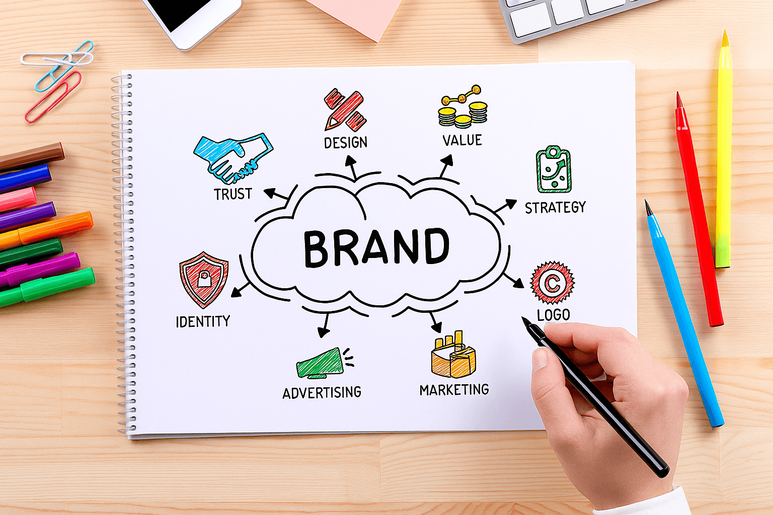
Key Elements of a Visual Identity A cohesive visual identity includes multiple interconnected components. Together, they build recognition, consistency, and trust.
-
Logo The anchor of your visual system. A logo is your most visible mark — it should be memorable, scalable, and adaptable for various platforms.
-
Color Palette Colors carry psychology and emotion. A strong palette enhances recognition and sets mood. For example, Indian brands like Zomato’s red conveys energy and appetite, while Tata’s blue communicates stability and trust.
-
Typography Fonts express tone. Sans-serifs often feel modern and approachable; serifs feel traditional or luxurious.Consistency in typography across digital and print assets strengthens brand cohesion.
-
Imagery & Photography Style Your choice of imagery defines how audiences emotionally connect with you. Candid, lifestyle-driven photography feels human; bold, abstract visuals feel conceptual and artistic.
-
Graphic Elements Shapes, icons, and patterns create visual rhythm. They add dimension to communications — helping maintain distinctiveness even when your logo isn’t visible.
The Process: Building a Visual Identity System A strong visual identity doesn’t emerge from intuition alone — it’s a strategic process. Here’s a simplified roadmap:
-
Discovery & Brand Strategy Alignment Define your mission, values, audience, and positioning before touching design. (At King of the Storm, this step is the foundation of every project.)
-
Moodboards & Visual Exploration Collect references that express desired tone and emotion — photography, textures, type, color inspiration.
-
Concept Development Translate strategic insights into initial logo and design concepts that reflect the brand’s essence.
-
Design Refinement Test scalability, color harmony, and real-world application. Ensure legibility, accessibility, and balance.
-
Guideline Creation Document everything — logo usage, color specs, type hierarchy, grid systems, image treatment.This becomes your brand guidelines — the tool that ensures visual consistency across teams and channels.
Visual Identity in the Indian Context India’s branding landscape is uniquely rich and dynamic. Visual identity here often blends modern minimalism with cultural depth.
-
Colors carry meaning. Warm hues — saffron, gold, red — evoke tradition and energy; cooler tones — blues, teals — convey technology and trust.
-
Typography diversity matters. Multi-language design (English + regional scripts) demands flexibility and typographic intelligence.
-
Brand authenticity wins. Indian consumers appreciate brands that reflect local relevance while maintaining a global aesthetic.
Examples: Amul — timeless illustration style reflecting nostalgia and humor. Paper Boat — visual storytelling through illustration and pastel tones. Zerodha — minimalist digital identity that conveys clarity and trust.
Future Trends in Visual Identity (2025 and Beyond) The next generation of visual identities is dynamic, responsive, and intelligent:
- Motion & adaptive logos that shift subtly based on context or platform.
- AI-assisted design systems that generate consistent layouts on the fly.
- Accessible color systems ensuring inclusivity across all devices.
- Data-driven design iteration using analytics to evolve identity assets over time.
The key? Flexibility without losing essence.
Visual Identity Audit Checklist Use this quick checklist to assess your current brand visuals:
-
Is your logo consistent and scalable across digital and print?
-
Do your color choices align with your brand personality?
-
Is typography consistent and legible?
-
Are your images unified in tone, lighting, and composition?
-
Do your design elements create cohesion across all platforms?
-
Do your visuals reflect the why behind your brand — not just the what?
If you answered “no” to more than two, it may be time for a visual identity refresh.
Final Thoughts
Your visual identity is not just what people see — it’s what they feel when they encounter your brand. In an era defined by infinite content and shrinking attention spans, clarity and coherence are everything.
At King of the Storm, we help brands translate strategy into emotion — crafting visual identities that not only stand out, but stand for something.